

There’s a big debate about what maps should be shown in school. The Nebraska Legislature passed a bill stating that teachers should no longer display Mercator projection maps, but instead use other projections like Robinson and Gall-Peters.
Social studies teacher Kristy McGuire explained the difference between Mercator and different kinds of maps.
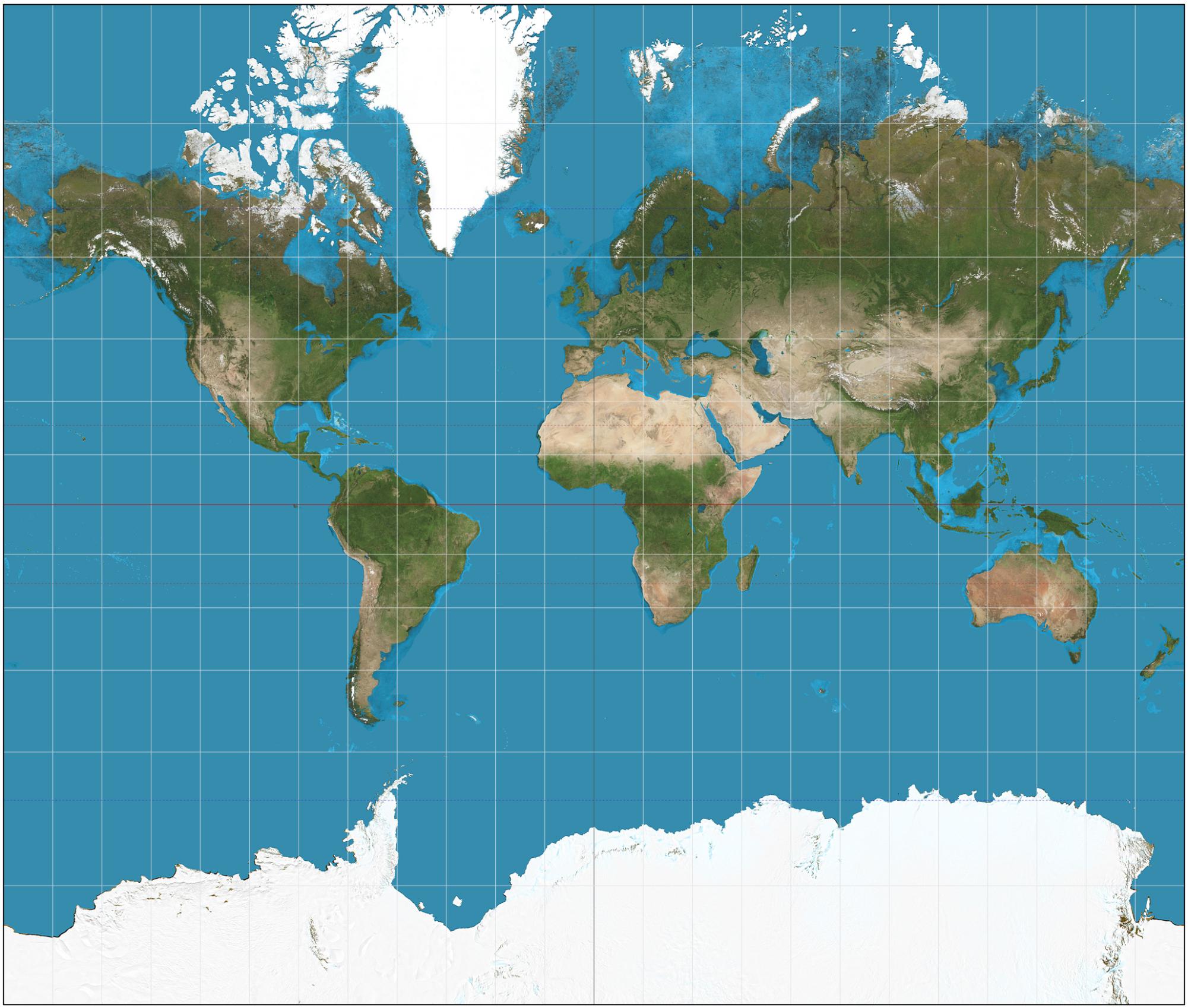
“There are many types of map projections, each serving different purposes. While I didn’t pay much attention to this topic initially, the Mercator projection stands out for its portrayal of the world, often much larger for the size of certain regions. This projection was commonly used during my high school years and still holds significance, especially in my AP Human Geography class discussions on map projections. However, it’s not ideal for classroom displays, as it can mislead students into thinking Greenland is as large as Africa, which is inaccurate. I prefer the use of maps that accurately represent areas like the Robinson.”
Lula McCaskill, a social studies teacher, explains why this would be deemed to not be used in education.
“Generally, they have been trying to not use the Mercator map for quite some time, and even though it’s not a law not to use it, we generally don’t because it distorts the land masses. So it will cause some places to look much larger than they are, and other places to look smaller. It gives the northern hemisphere more importance than the southern hemisphere. If you look at Greenland it’s larger than Africa on a Mercator map, when it’s not.”
These types of distortions can easily confuse an adolescent’s mind. According to McGuire, it can negatively affect a student, “If you are a young child and you don’t have an understanding of the world, and even if a teacher explains it in class, they can’t understand how it distorts the size or why it distorts the land size closer to the poles, so a student could easily look at a Mercator projection and think that Europe is much bigger than it is.”
Teachers already have an understanding not to use these maps, McCaskill said, “The Gall-Peters map also has distortion but it’s elongated, it’s odd to the eye, but it’s pretty accurate. All map projections have distortions. I’m unfamiliar with autograph projection maps, but definitely, people don’t like change. I think a lot of legislators may not know that we don’t use the Mercator projection, but we use it just to show the differences. Generally, most classrooms have a Robinson map. I use it for the most part.”


Steven H. • Oct 8, 2024 at 11:42 am
A remarkable exploration of cartography. The author’s meticulous examination of the evolution of maps from ancient civilizations to contemporary digital technologies is both enlightening and thought-provoking. The deft juxtaposition of historical anecdotes, scientific explanations, and cultural perspectives creates a truly immersive reading experience.
I was particularly intrigued by the exploration of various map projections and their profound influence on our understanding of the planet. The author’s ability to make complex concepts accessible to a wide audience is commendable. The clear and concise writing style, coupled with illustrative examples and engaging visuals, ensures that even those unfamiliar with cartography can grasp the key ideas presented.
In conclusion, this article is a testament to the author’s expertise and passion for the subject. It is a must-read for anyone interested in the history, science, and art of maps.
Aaron • Oct 8, 2024 at 10:55 am
THIS LOWKEY MIGHT BE THE BEST ARTICLE I HAVE EVER READ THIS ARTICLE IS SO INTERESTING AND WELL WRITTEN IT DESERVES ALL OF THE AWARDS I CANT SAY ENOUGH GOOD THINGS ABOUT THIS MASTERPIECE I JUST STUMBLED ACROSS THIS AND NOW I AM A WHOLE NEW PERSON AND WANTED TO THANK GOD AND THE GOOGLE ALGORITHIM FOR GIVING ME THIS MASTERPIECE AGAIN THIS IS JUST SO GOOD I WANT WHOEVER WROTE THIS TO KNOW THEY GOT A FUTURE IN THIS BUSINESS BECAUSE THIS IS INCREDIBLE
Admin • Oct 8, 2024 at 11:21 am
This story is getting a lot of views and we’re all wondering how and where people are reading this. Tell me how you came to see it.
Aaron • Oct 8, 2024 at 11:36 am
Indeed.
jerry cose • Oct 8, 2024 at 10:42 am
very good article and presentation of the difference between maps and how we need to view each type!